810 Wellness Bar
810 Wellness Bar
Juices, Smoothies, and More
What originally began as a plan to open a juice bar in Flint, MI to give back to the community and provide a safe space for teenagers to spend time has pivoted into a college quick stop for a healthy drink or snack!
We were tasked with creating an eye-catching visual identity and branding strategy that conveyed healthy food and beverages in a youthful and modern way.
LOGO DESIGN
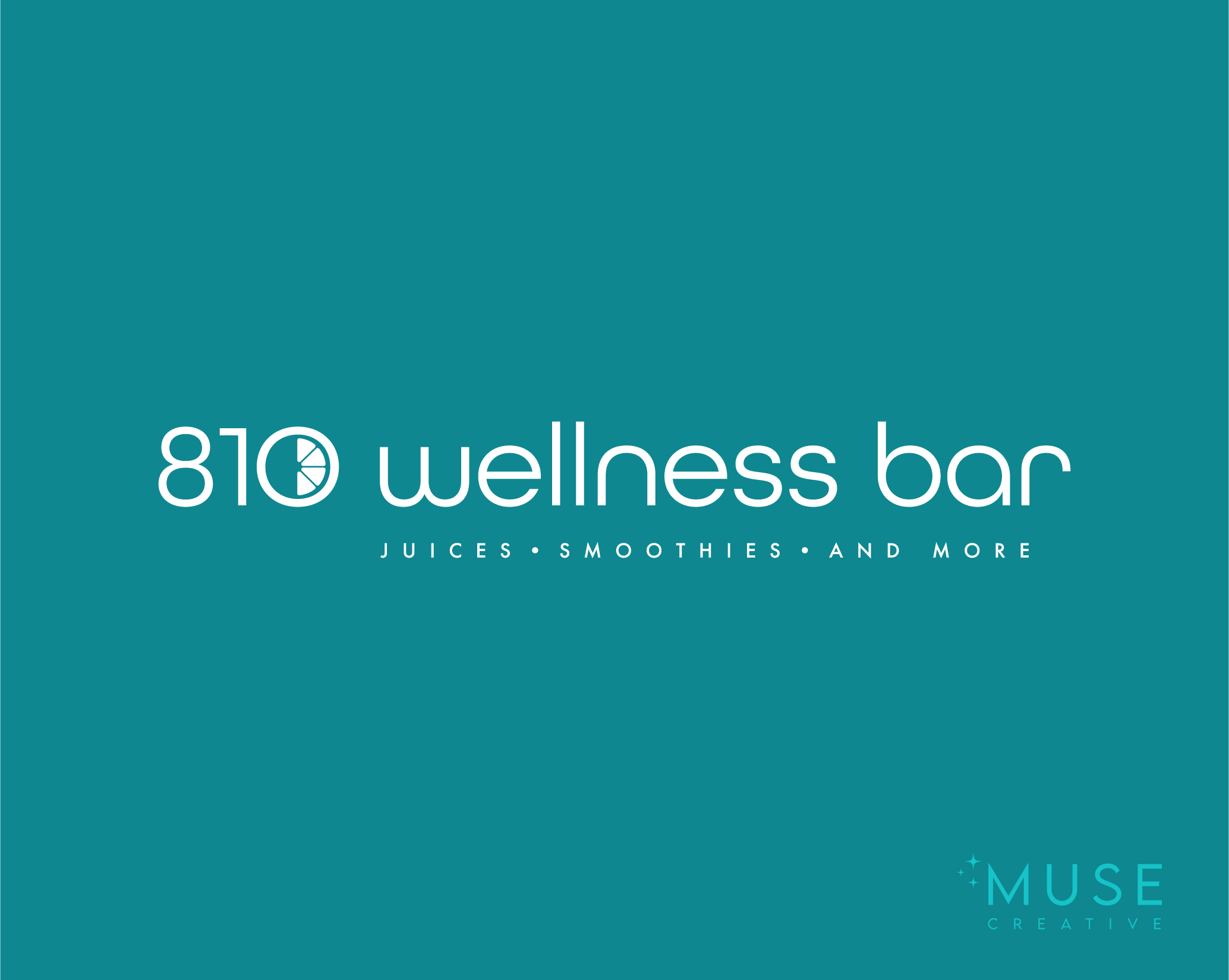
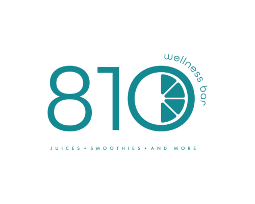
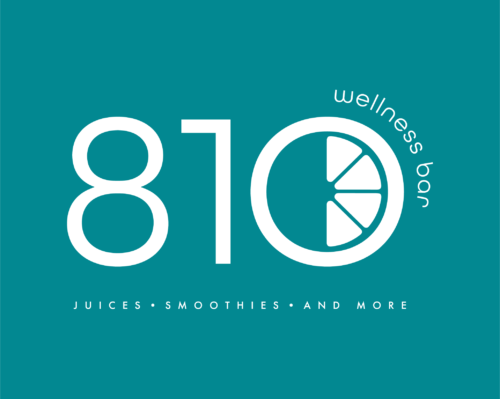
After hundreds of designs, we landed on a customized typography treatment that was round and open, giving a friendly vibe with shapes reminiscent of the fruits that go into the juice and smoothie options. This nod to the business was also extended into the “0” of 810 with a stylized fruit graphic.
Our goal was to maintain the playfulness of the fruit “0” throughout all versions of the logo: Primary, Secondary, and Social Avatars.

Color Palette
The color palette was designed with interior space in mind. We created color palettes that could mix and match well to create striking, balanced visuals. Blush tones and soft, dusty blues contrasted the rich jewel tones of sapphire blue, emerald green, and teal.
The softer tones create breathing room and space in an interior setting (benches, chairs, fabrics, etc).
TYPOGRAPHY
We wanted to ensure the logo type treatment (which was custom designed and created by hand) worked seamlessly with any other branded fonts.
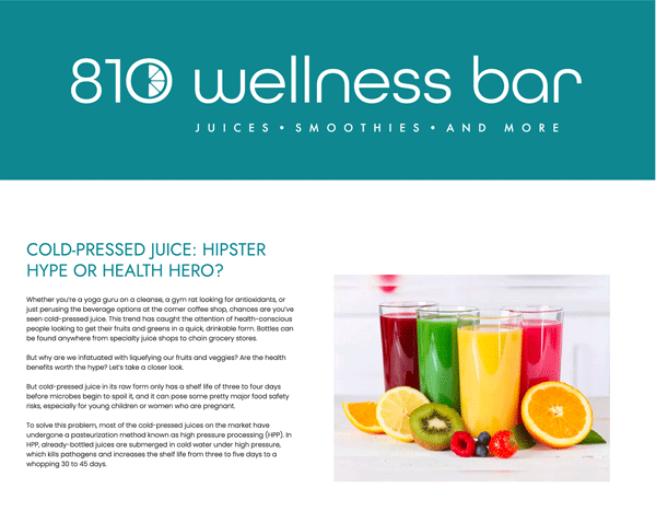
Rather than use a similar rounded headline font that may create visual competition, we opted for a sharper san serif, which connected the brand by its modern feel and openness between (and within) letter spacing, but kept it unique and interesting in a balance of sharp and smooth edges. This gave the headline text authority and professionalism for the business.
Body copy retained a rounder feel to tie everything together and give the viewer a friendly and approachable feeling.
To give our client an idea of how it all comes together, we created a mockup of an email newsletter to show how logo, headline, and body copy text collaborate.
STYLE GUIDE
After designing a custom Logo Kit, Color Palette, Typography, Social Graphics and Interior Design parameters, put everything together in a comprehensive Style Guide for our client to increase brand awareness for current and potential customers.
This also allowed our client to create consistency in their visual branding as it expanded into additional products and marketing materials. Clearly set rules for logo, color, and typography usage made everything simple and straightforward.
Social Media Graphics
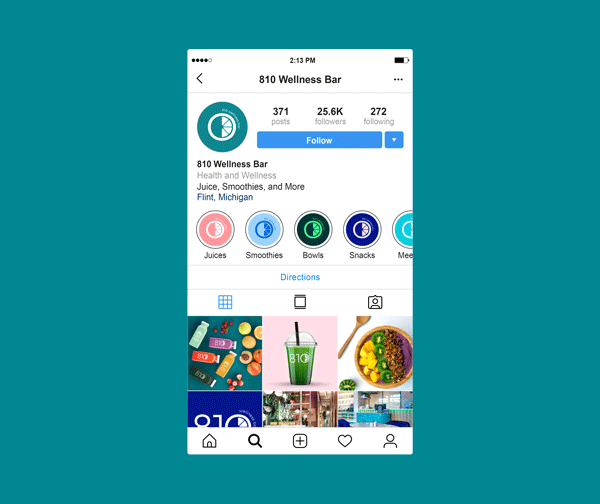
With custom graphics that mixed and matched the colors from the Color Palette, Social Media content was limitless. We created graphics for social media that could be used as avatars and highlight covers. While banners for Facebook and LinkedIn were initially created, it was decided that showcasing the business’s actual products (smoothies, juices, or acai bowls) would be best to entice potential customers.
Note: This image is a mockup and not a reflection of current social media for 810 Wellness Bar.

Website Design
The website designed by Muse Creative reflected the anticipated brick and mortar location in Flint, Michigan. One of the goals was to incorporate brand colors throughout both digital and physical spaces to create a cohesive customer experience. We searched for fabrics, textures, lighting, and color palettes to collaborate with an interior designer on ways to best bring this business to life.
The intention of the website was to provide information to the viewer, but also beckon them into the space and offer a sample of what that experience would be through full screen imagery of the space and motion effects evocative of setting the stage in film.
Following the website completion, the business changed models several times and is moving away from a dedicated retail location in favor of a quick food and beverage stop for college students. The website was forced to close while this change is ongoing, but we are hopeful that some of our thoughtfully created designs will be reintroduced into the next website’s creation.
Additional Promo
To build anticipation and inspire the branding direction for 810 Wellness Bar, we created a video mockup with the styling we felt would be well-suited for 810 Wellness Bar to be received as an upscale, modern business.
This video was also intended to serve as art direction for the quality level expected for all video and images and featured additional mockups of products.
The products, ingredients, and imagery shown in this video are not actual 810 Wellness Bar products.
Imagery and video rights are licensed to Muse Creative. This video is not to be used by another party.
