Skin Lab by Inga

Feel Amazing in Your Own Skin
Med Spa Treatments and Services
Skin Lab by Inga is a Med Spa business with multiple locations throughout Georgia. Known for her up-to-date services and gentle approach, Inga’s mission is to deliver beautiful skin that radiates.
We redesigned Inga’s existing Visual Identity to create a cohesive, stand-out brand that reflects her personality and values. We then implemented this Identity into her redesigned website and incorporated best UX practices.
We are currently assisting Skin Lab by Inga on Social Media with fresh content and a cohesive experience across all touchpoints.
CLIENT'S EXPERIENCE
LOGO REDESIGN
Before the rebrand, Skin Lab’s logo was simply the business name in a gold script font, created on Canva. While there wasn’t any thing wrong with it, there also wasn’t any strategy behind it. It wasn’t distinct and anyone (including a competitor) was able to recreate it with ease. It also sat against dark backgrounds, which didn’t fit with Inga’s personality and approach.
After diving deeper into the business’s mission and core values, we created a new logo that was modern, approachable, and customized by hand to avoid copies.
Visual Identity Design
Skin Lab by Inga did not have any established colors, fonts, image styles, etc for their business. The logo was originally in gold. The backdrop was black. The website featured aqua blue as well as multiple hues of pink. With the new strategy and logo design in mind, we created a brand Color Palette, Font Pairing, and Image Styling parameters and built a Visual Identity system to increase brand awareness among customers. This was organized into a comprehensive Style Guide for our client.
MARKETING MATERIALS
After the visual identity had been established, it was time to update some of the existing marketing materials to reflect these updates. We redesigned premium business cards to not only look like the new branding, but also feel like it. We wanted to convey the smooth, soft, glowy skin that Inga’s services provide. To achieve this, we used a velvet soft touch card (for smooth, velvety skin!) with her logo in a raised spot gloss finish on the back and front (reminiscent of glowing skin and serums). This makes the customer retain the information better (and want to hold onto the card more!), as the sense of touch is incorporated. Other marketing materials we created were new brochures, rack cards, and a half page magazine ad.
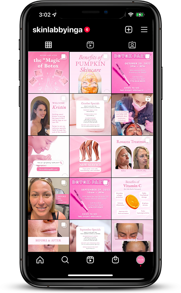
SOCIAL MEDIA
Skin Lab by Inga’s social media presence did not have any consistency in color, typography, or any other visual cues to let the audience know which page they were on. We redesigned the Social Media page with our Strategy, Design, and Management package. We are currently responsible for content, design, and management of the Facebook and Instagram pages. Now the established Visual Identity is included and all images are watermarked. Within the first two months of our management, her account grew by 293% and her reels engagement increased by 444%.
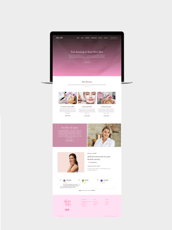
Website Redesign
Before the redesign, Skin Lab by Inga’s website wasn’t cohesive and did not contain a clear message or identity. The images featured contradicted the brand message. Instead of images of women with clear, glowing skin, there were models with heavy makeup.
There were also too many colors and fonts, which made the website forgettable. It featured gold, black, aqua, pink, and cranberry tones. Many of the pages contained no imagery and felt sterile and uninviting.
We incorporated the fresh look within the Style Guide to create a cohesive message that was visually engaging and true to the business.
You can view the new website design here!
Check out the before and after below.